
Location: Beijing
Type: Architecture Renovation, Spatial Design, Installation Design
Program: Children, Learning
Scope: All Design Phase
Time: 2020
Building Area: 2180 sqm.
Building Height: 3.5m
Team: Zheng Tao, Fernie Lai, Alan Hung, Mark Wang, Cassie Zheng, Zhang ZeQun, Li XuDong, He JingYang
Collaborator: Lighting: J Studio
Collaborator: Key Materials: Kvadrat for Wall Finishes & Furniture, Forbo for Floor Finishes
Photographer: Fernie Lai
WAY Studio creates a casual and nature inspired learning environment for their latest project, MTG Learning Center. In the eyes of children, nothing is yet set in stone, including the definition of our surroundings — walls don’t always have to stand straight, nor hit the ceiling, floors can be uneven, it is exactly this type of instability or uncertainty that we would like to recreate in order for children to learn through exploration, to define “space” as their own — just like in the forest.
.
MTG Learning Center is located in Beijing, it is a transformation from an antique market to an education center. WAY was invited to renovate and design the public space on the ground floor and propose a new plan for the second floor. The overall area of this project is approx. 5,700 square meters. There are 6 multi-functional classrooms, a wood carpenter workshop and a gymnastic classroom. The whole plan is free and open, whilst meeting the educational and recreational needs, it could also be used for dinning, lectures, and workshops.
.
.
.
From Old Retail Space to Learning Center
.
In metropolitan cities, there has been a shift towards renovation rather than new construction, and from permanent function to spatial flexibility. The architects often face the challenge of accommodating the increasing needs for open, flexible, and multi-functional spaces within the framework of existing buildings.
.
The building selected to house the MTG Learning center was originally an old retail space with low ceiling. Facing to north, the lighting condition is also unsatisfying. WAY’s design ensures adequate natural lighting, ventilation and air quality through a semi-open spatial layout, flexible furniture units and diverse lighting systems.
.
The original staircase connecting the first and second floor is transformed into a feature staircase. In order to satisfy safety concerns of an open staircase, instead of putting up huge railing walls and safety nets throughout, WAY decided to fill it up completely with playful elements instead. A scuba mirror to reflect activities on different floors, display cases reserved for children creations, and voice pipes that penetrates the stair floor allowing children on different floors to speak to each other through this installation.
.
The spatial layout of MTG Learning Center is inspired by “puzzle” to create a free and flowing plan. Staggering spaces conforms to the pre-existing plan outline, which reduce the length of long narrow hallways. Floor to ceiling walls minimize noise between classrooms, whilst low walls between hallways and classrooms blur the boundary between the public and learning spaces. Furniture can also be reconfigured according to needs, and each set of furniture is supplemented by platform or wall space displaying works created by children.
.
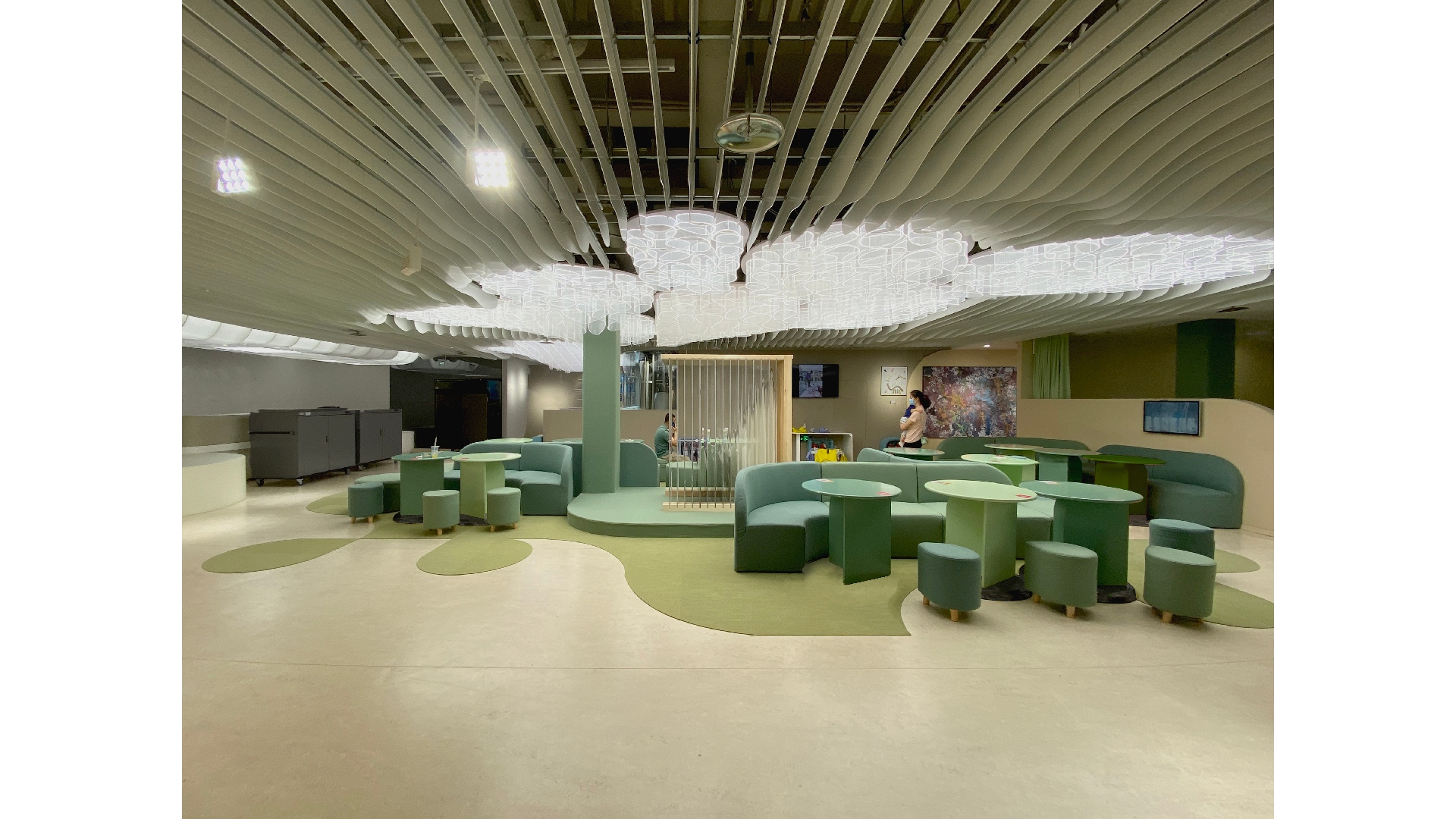
Diverse wall heights meet the needs of both children and adults. It allows children to feel secure in an enclosed space, while views open up at higher level for adults. Cushioned walls and flooring as well as a louvered ceiling system ensure proper acoustic environment. Curtains were also installed to supplement potential classroom divisions, which further reduce noise and provide different lighting conditions.
.
In the classrooms, furniture is used as walls for reorganizing spaces for different activities. The light in the classrooms resemble three teeth with adjustable brightness for day, night and cleaning modes.
.
.
.
Family Space
.
The MTG Learning Center adopts the Reggio Emilia approach, which considers the psychical space as an invisible “teacher”, as the environment could stimulate social interactions, create sense of community and contributes to the cultivation of communication skills. MTG Learning Center provides adequate public spaces for children and adults, ensuring a comfortable place for these two groups to communicate and interact.
.
The second floor is the main space for educational activities, and the open space in the center becomes an open plaza for kids to explore. The light installation design is inspired by trees. With layered acrylic panels, three light installations naturally create gray spaces in the public areas, which attracts the users to stay and gather around.
.
.
.
Colors of Nature
.
The whole space is filled with brilliant colors and playful details. Orange, green and red are applied to create an energetic atmosphere, which also differentiates different functions. The bathroom has an umbrella-like structure, which is in vivid red color with theatrical effect. Spaces are also reserved at the entrance and hallways for displaying the children’s artworks.
.
The first floor is covered with flowing curvy surfaces, where layers of set-back seating provide a tranquil transition from the hustling city life outside to the imaginative space inside.
.
“We want to create a space of unknown that allows the children to explore and experience by themselves.” MTG Learning Center provides an inspirational space for children’s growth and also ensures adequate communication between the children and the parents.
.
.
© 未/WAY Studio 2020